An algorithm is a sequence of steps that solves a problem.
This is how we understand computing. It’s linear. It answers questions for us.
With his unconventional ‘house post’ site, BCIT web developer Alan Etkin has broken some basic rules about what a website should be. He wants it to confuse us, to raise questions. This site is anything but linear.
At first glance, its simplicity is striking. There is no banner, no advertising, no photography, no call to action.
In the centre of a white background is a mosaic-like image, a rectangular drawing made up of 12 square tiles. Together they show an sketch of an Aboriginal design that looks like two faces and a feather, or maybe a wing. It’s unmistakably West Coast Indigenous, sourcing its imagery from that ancient tradition. Yet it feels modern and minimalist. When you drag your mouse over the tiles, each pops up slightly, then falls back into place once the mouse has moved on. It gives the impression of a magnetic children’s toy, or perhaps a finger passed over water.
It’s unclear what the purpose of this site is. At first, the lack of clarity can be frustrating.
“I’ve seen people hit the site in an ADD mode, and bounce off with disdain,” Alan admits. “The key to the site is giving yourself time to explore.”
Alan says his creation is strategically playful. He wanted to build something that would speak to students on campus – members of Generation Z. He also wanted to honour the subject matter of the site – BCIT’s 17-foot-tall Coast Salish house post.
The carving was commissioned “to honour the traditional lands of the people who are here,” says Joanne Stone-Campbell, the coordinator of Aboriginal Services. “We wanted to raise our hand up to them for allowing us to study on their territories.” BCIT’s Burnaby Campus stands on unceded territories of the Coast Salish nations.

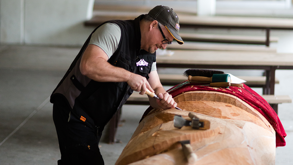
Aaron Nelson-Moody—known as Splash—was chosen to carve the piece. He is a renowned artist, storyteller, and teacher who has spent years working with community groups and schools, and has shared his teachings in Scotland and Japan. The Vancouverite cut his storytelling teeth in the basement ‘headquarters’ of AdBusters magazine more than thirty years ago. He’s a stalwart of the Indigenous community here.
House posts are carved to reflect the character and values of the families and community they look over. Splash worked with BCIT staff to develop the design. Alan Etkin heard the call to participate, and decided to offer an online presence for the post, a way to connect the physical with the digital. He approached Splash with his idea—but the full idea would need Splash’s help.
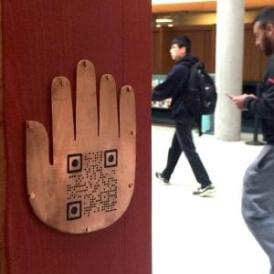
Alan asked Splash to hand-carved a QR code and add it to the post. “It’s a quirky nod to the wide range of technology taught here,” says Alan. “I wanted the QR code to scan through to a website, extending traditional storytelling into the digital sphere.”
Splash bought in immediately. “I think it speaks to the idea of collaboration. I never would have come up with this idea on my own.”

Splash does not often sign his work and was struggling with how to sign the house post. A few traditions swirled in the back of his mind. One idea was to add an object on or under the house post itself. It is a Coast Salish tradition to bury a sand dollar under the carved poles. While sand dollars aren’t valuable, they are a marker for wealth. “We wanted to embed something that’s symbolic of the richness of this community,” says Splash. So, when Alan suggested he carve a QR code—a playful tribute to BCIT’s technical prowess—it fit.
The QR code would be hand carved onto a copper outline of the Snewayelh, the hand-shaped logo for BCIT Aboriginal Services. Snewayelh means “teachings.” It symbolizes the passing of knowledge from one generation to the next.
The technology exists at BCIT to carve the code mechanically, easily and accurately. But, as Alan points out, “there’s something about the hand-craftedness of it that is just really quirky. It matches with the artistry of the pole itself.”
Splash adds, “honestly, it was a really interesting design challenge.” He’d technically completed his work on the pole, but kept working at this element. “I was so intrigued, I just kept going. It was really hard.”
In taking on that challenge, Splash unwittingly challenged Alan to design a braver site.
“After several attempts, he got the code to work seamlessly,” says Alan. “Inspired by his efforts, I set about designing a site that respected aboriginal art and culture, and pushed the boundaries of technology.”
Alan wanted to build a site that would reach students through their ubiquitous cell phones. “These kids have been using mobile devices even before they could read,” he says.
Alan and his team had a lofty goal: contrast the instant gratification of today’s social media culture with the much slower pace of aboriginal culture.
“To do that, we had to break some core principles of usability,” explains Alan, “forcing visitors to explore.”
The final product has a game-like quality. Users select tiles on the site, with no hint as to where that selection will lead. It’s a bit like a digital choose-your-own-adventure story. Sometimes it goes to content, sometimes not. As each tile is selected, the drawing transforms into an image of the finished artwork, symbolically mirroring Splash’s journey.
The need to explore reflects a basic tenant of indigenous education—the hunt for understanding. Users aren’t given an answer. They must come up with the meaning for themselves.
“That is what Native art is for,” says Splash. “In Coast Salish teachings, we encourage students to take an extra minute to go a little further to get to know what they want to know.”
Joanne Stone-Campbell agrees. “The site demonstrates that creativity, that playing, that hands on experience that our people learn. When our elders tell us a story, they don’t give us what it means. We figure it out, wherever we are in our life. The website makes you curious.”

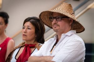
Curiosity is something both Alan and Splash advocate in their work, perhaps a shared trait from their past. After some time, they remembered how they’d first met. The two men worked together in the Vancouver office of AdBusters magazine, more than three decades ago.
“That was an interesting place,” recalls Splash. “We talked about the power of communications and the limitations of different media.”
“This collaboration is an appropriate nod to those early days at AdBusters,” reflects Alan.
Splash thinks the site is also a deeply appropriate nod to First Nations culture. “We come from an extremely innovative society. Throughout our history, we have thought about how to integrate innovation carefully into society so that it doesn’t do as much harm as it solves.”
This project speaks to both BCIT’s respect for indigenous culture, and its willingness to take on innovative, applied technology projects. The results have been inspiring.
“I demonstrated scanning the QR code to a First Nations student,” recalls Alan. “I left him to talk to another student, and from a distance noticed him running his fingers over the carved code, like he was processing its meaning. It was a very cool moment.”
Splash has seen similar moments happen, and says, “I think that, like a lot of art, Alan’s creation now stands for a lot more than he originally intended.

Alan, It was so nice to read about your project. Very exciting