We have tried to provide maximum layout and content flexibility while still ensuring the visual design is aligned with BCIT’s web branding. Below you will find an explanation of the various layout and widget options and some best practice suggestions in how and when to use various features. You must be the site admin for your Commons account to edit any of the layout, settings and widget options on your site.
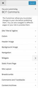
This theme handles most settings and options through the WordPress customizer (pictured, right). The advantage to this method is that most visual and navigational features are accessed from the same place and make use of a WYSIWYG interface so you can see what the changes will look like live, as you edit them.
Unless otherwise indicated, all options below are accessed from Appearance » Customize, and in fact if you click other links in your appearance menu, you’ll usually be taken to the customizer. One thing to remember … Whenever you are playing with options in the customizer you must click Save & Publish at the top of the page before you leave or your changes will be wiped out when you do.
click before you close
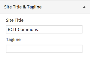
Site title & tagline: You can edit your site title/description from here (in addition to Settings » General from the main menu), but may no longer hide the text, as you could with the previous desktop theme. The main reason for this change is that the header image is now a background and doesn’t change size as the viewport gets smaller. As such, we cannot ensure that text embedded in your header image will be legible (and in fact, we can pretty much guarantee it won’t be on most phone browsers). The site title is the persistent link home on your site. For more information see bullet 3, below.
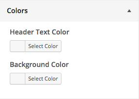
Colors: From here you can set two key options, the text colour in your header which affects your site title and description, and the background colour for the site which is hopefully self-explanatory. The text colour in your header is important because you want it to be high contrast with your header background while keeping in mind how it fits with the rest of the theme. Please use background colours carefully, as exceedingly bright colours assault the eyes and often distract from your content. If you want to reset to the default background, the hexadecimal code is #929292.
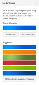
Header Image: You can choose BCIT sector colour images or upload your own. This works hand in hand with your site title and description choice, above. Again, please note that, as we do not allow you to suppress the display of your site title and description, we strongly recommend you do simple, solid header images that work well with the site title and description overlaid. It is also advisable to test how it looks on your phone or by dragging your browser window to emulate a mobile device viewport.
- The image is now a background image and does not resize on smaller viewports, so the image will simply get cut off in smaller browsers.
- The header size gets very small on mobile devices and the theme has been designed for the site title to sit on top of a solid simple (not busy) image.
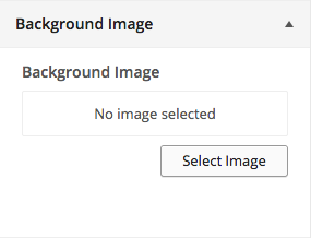
site background
Background Image: If you really want a background image for your site and a solid colour isn’t to your liking, you can upload one here. This is another option you should use carefully. Busy images will detract from your content, large images will add a lot of page weight to the loading time of your site and images must be big enough to look good on typical large monitors (2200 x 900 pixels). And, as people view your site on mobile, the background image is gone on portrait tablet-sized viewports and below.
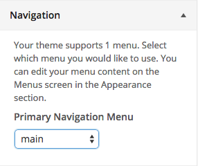
Navigation: This is the one partial exception to using the customizer. To edit the items in your main menu or set up additional menus for use in widgets, you must access them from Appearance » Menus. From the customizer, you can simply set the main site menu, from menus which are already available.
More about navigation:
- We strongly recommend no more than two levels of navigation on your site and having all key site navigation in your main menu.
- All levels will show up on mobile devices as well, but long nested (parent-child) menus become difficult for mobile users.
- You can use sidebar widgets for sub-sectional navigation, but keep in mind that those using mobile devices will see these menus at the bottom of the page. People are becoming very used to drop-down menus triggered by touch.
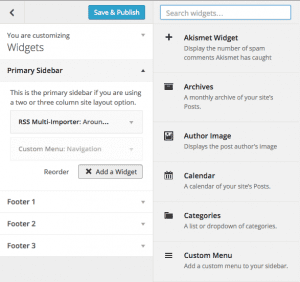
Widgets: Editing widgets is actually a pretty good experience in the customizer and we strongly recommend doing it from here, as opposed to Appearance » Widgets, as you can see widget content edits live from the customizer. See more below about managing and editing widgets.
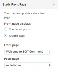
Static Front Page: Here you can choose to display a static page as your site/blog homepage. If you do, you need to have a blank page available to use for blog posts (unless you’re not using the blog feature). If you do this, don’t forget to include the blog page in your main site navigation.
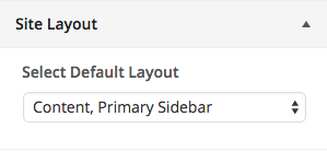
Site Layout: When we set up your site, we set up the default layout with one sidebar on the right-hand side. You can have single or double sidebars to the left or the right of your main content area, or even one sidebar to the left and the right AND even full-width pages with no sidebars. Instead of including a bunch of screen shots here, test different layouts in the customizer and see what you like. Single sidebars are usually best unless you have a lot of ancillary content/links. All sidebars will also get stacked below your content on mobile devices.Unless otherwise overridden on individual posts or pages, this layout will be used on your entire site. And … yes, you can put whatever layout you like on both posts and pages. Again, though, a word of caution that you should only change page layouts on individual pages for a good reason. Constantly changing structure in your site is very jarring for your visitors and not a good user experience.
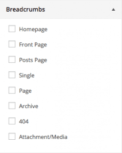
Breadcrumbs: We don’t recommend using breadcrumbs (navigational backtrack links at the top of your page), but they can be useful if you have a very large site and may be preferable to nested sub-menus on mobile devices for some visitors. You can set these to appear or not on all major page types on your site.
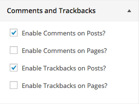
Comments and Trackbacks: You can enable/disable these on posts only, pages only, both or none. Trackbacks are like comments and treated the same way by WordPress, but are links to your content from other places.
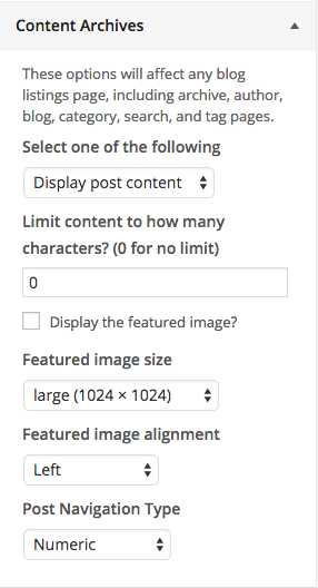
Content Archives: Here you can set how your content appears on monthly and category archive pages. You also need to be careful here, but you can choose full content, excerpts and can choose custom image sizes and alignment if you’ve set a featured image on posts.
A word about widgets
Widgets have two primary uses in WordPress. They are an easy way of inserting menus, navigational links and visual promos within your site and are also an ideal way of featuring content related to your site from other sources (Flickr photos, YouTube videos, RSS feeds, etc.). While we have provided several widget-ready areas in this theme for you to use, we strongly recommend you use them cautiously. Too many blocks of menus or links to external content can easily become a distraction to your visitors, diluting the value of your content.
If you want a search bar in your site, add it via a search widget wherever you want on your site (top of the sidebar or the footer is a good location). We no longer have a toggled search bar in the theme header.
While you customize widgets in the same way as all other theme options, you may also want to access the widgets page from the link under the Appearance menu from your site’s admin panel. This will allow you to access Inactive Widgets so that you can save settings in unused widgets for later use.
